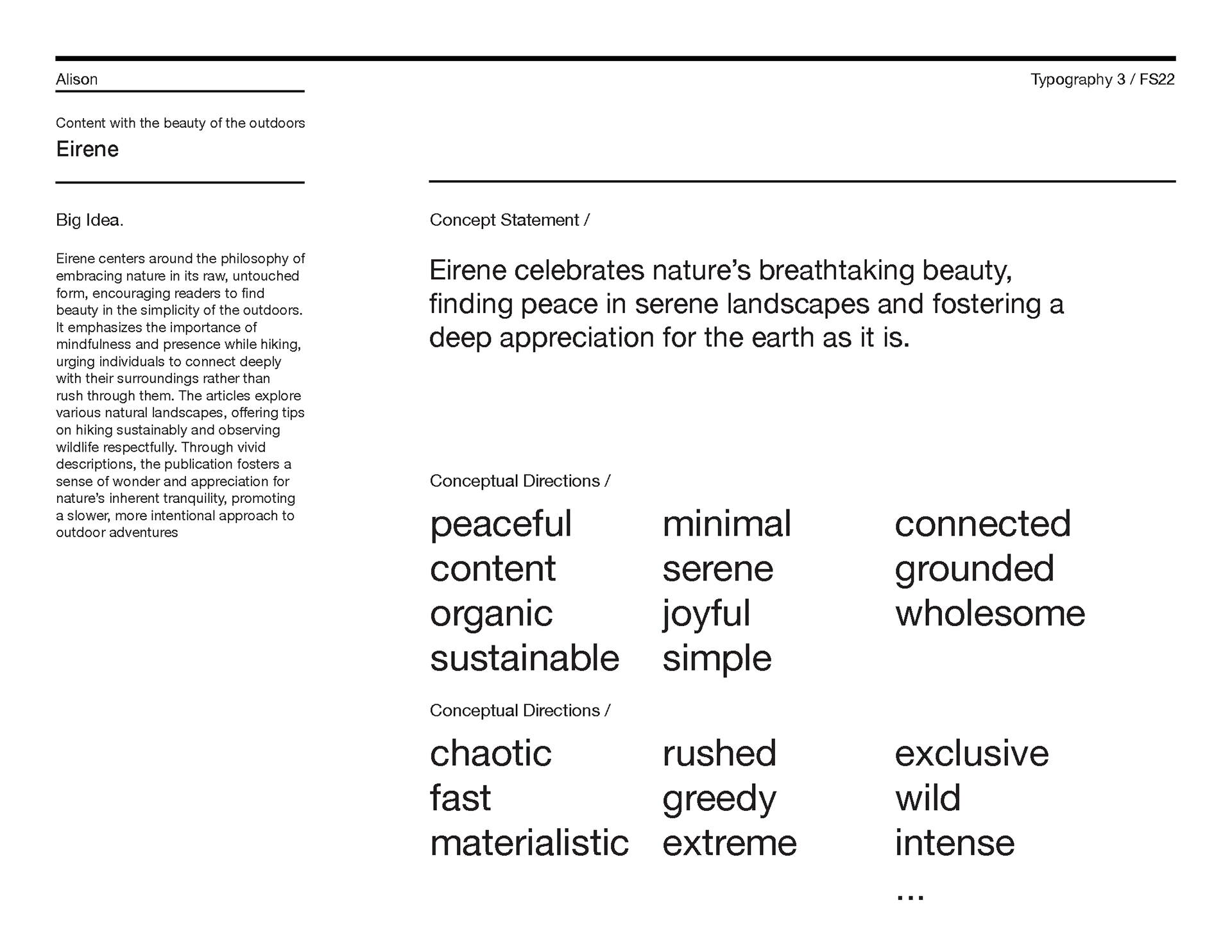
Concept
Create a magazine with a cohesive visual identity and typographic system that clearly organizes and presents content. Create studies that explore type hierarchy, pairing, and layout, and establish design standards through an expressive wordmark and clear guidelines.
Constructing a Brand Identity
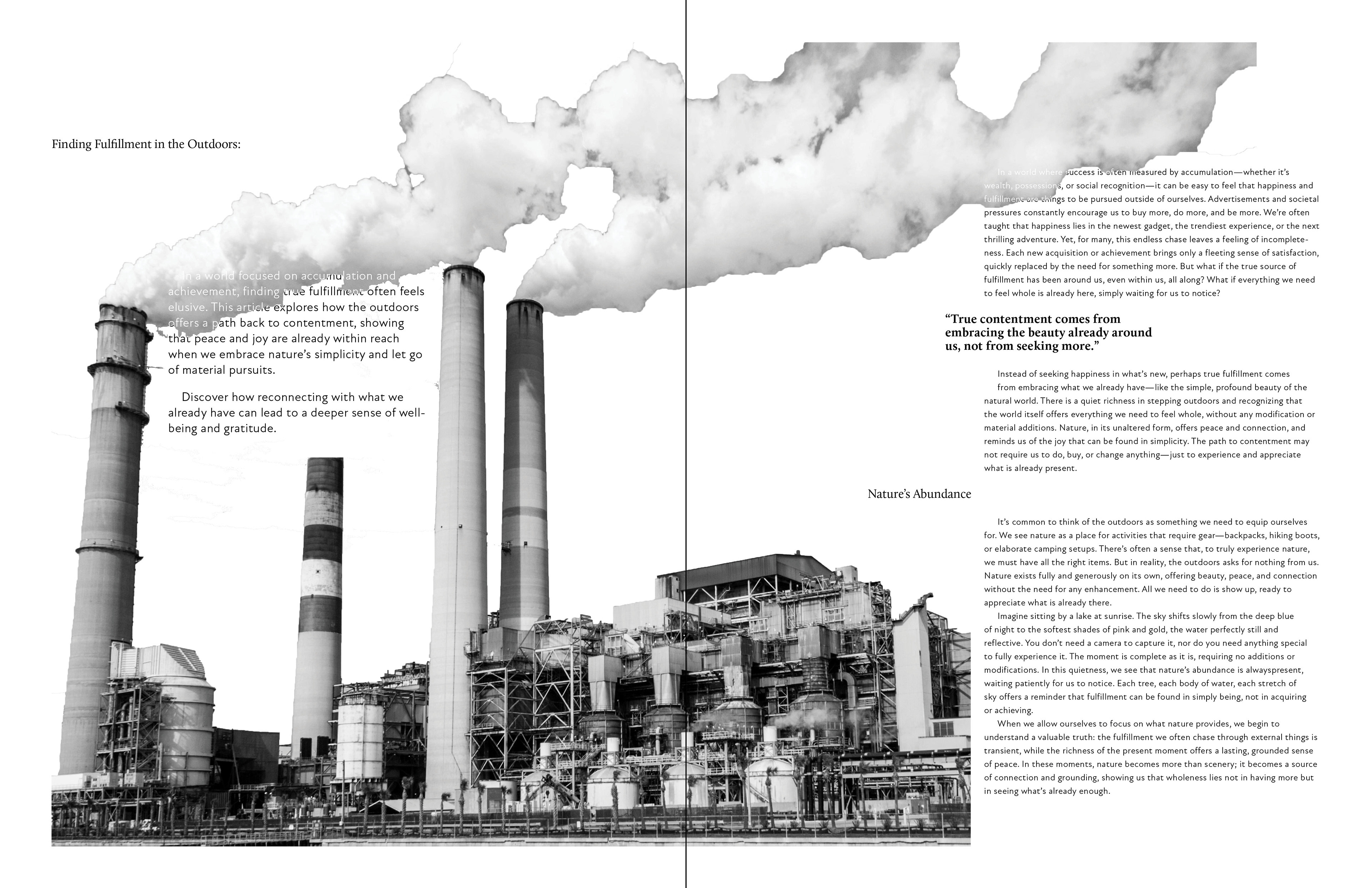
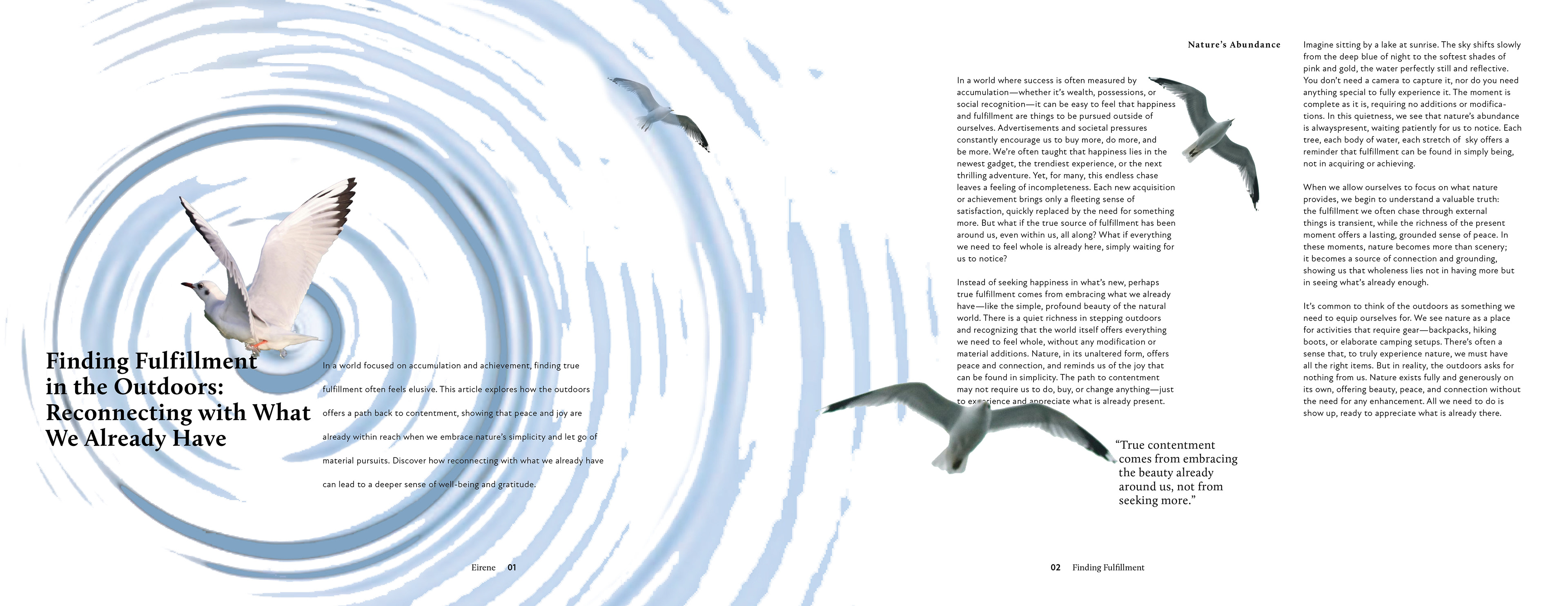
The idea for Eirene came from a video about a bill that moved to turn large portions of wilderness in Florida into golf courses and pickleball courts.
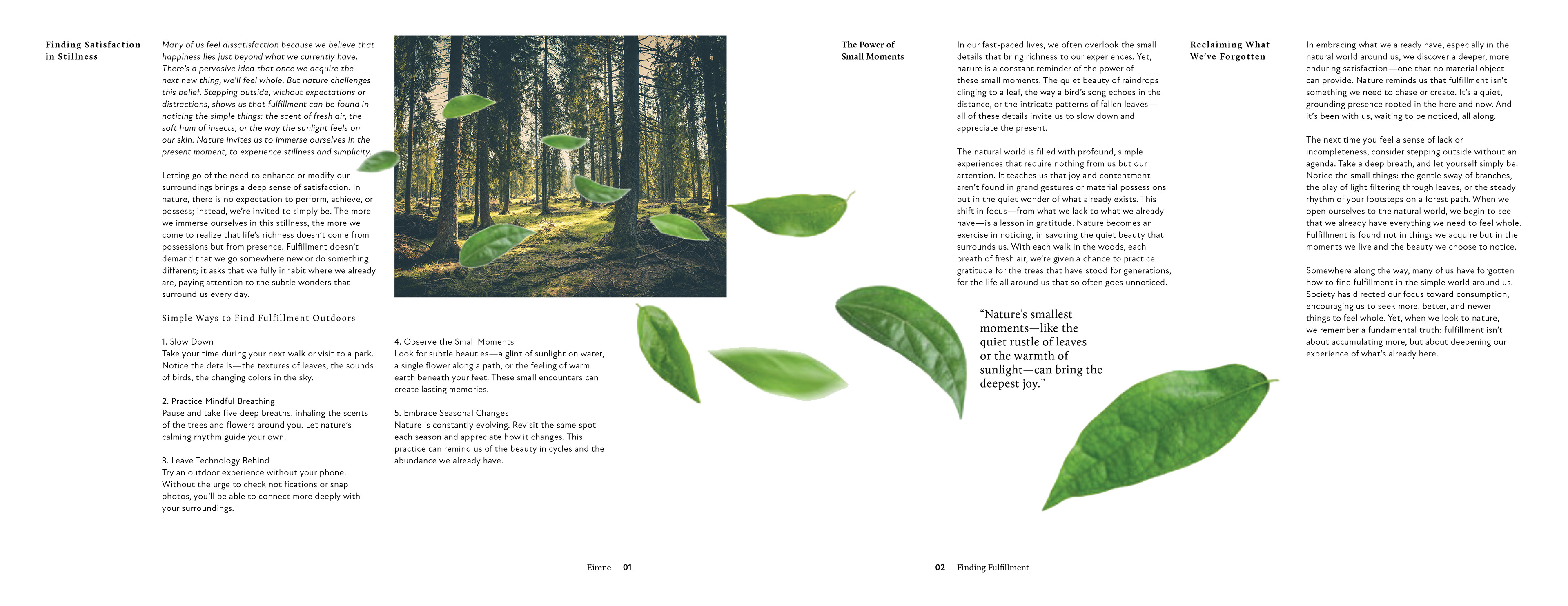
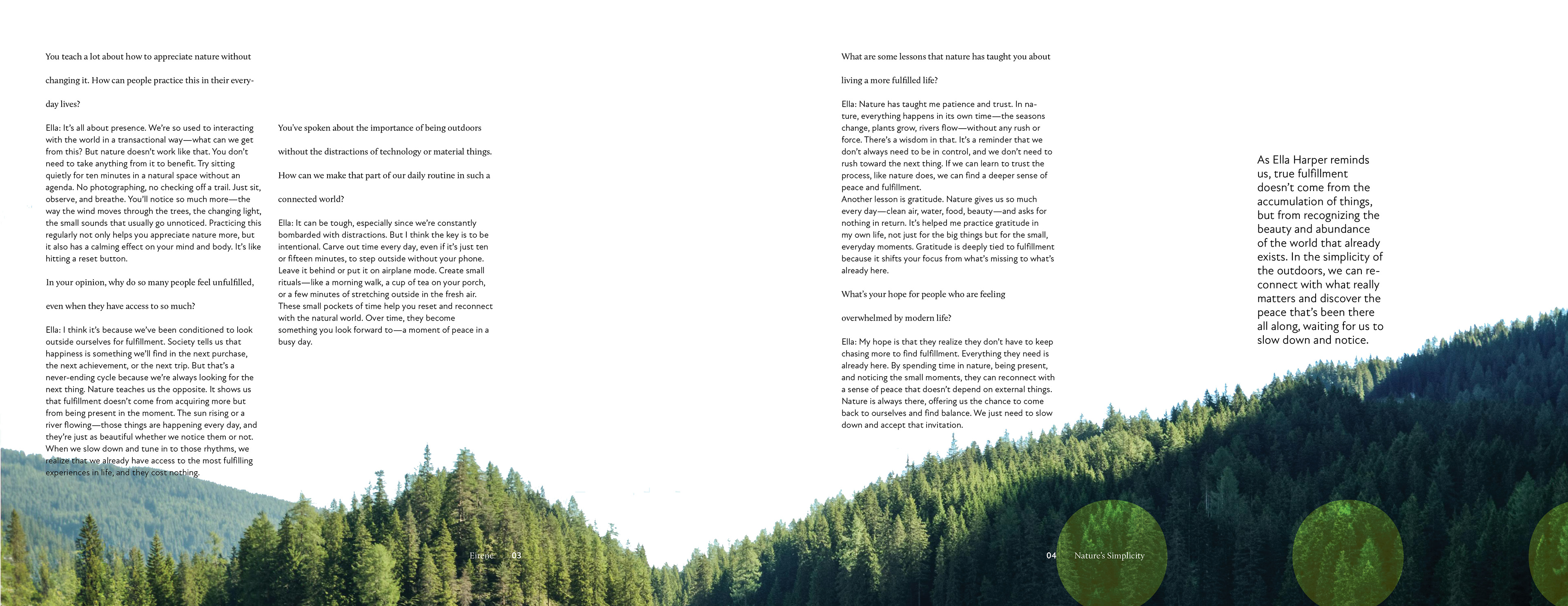
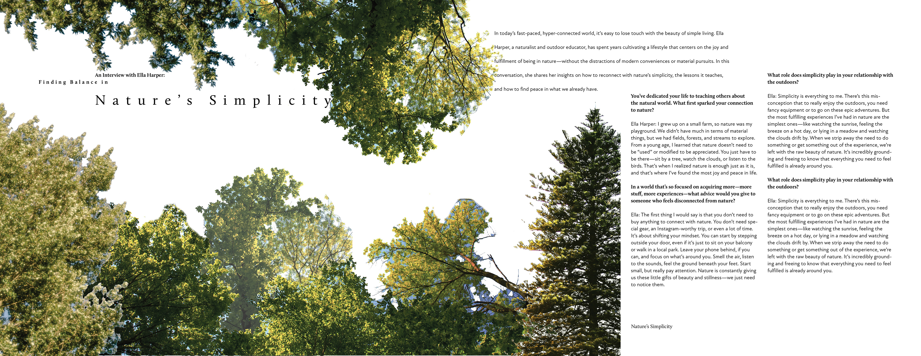
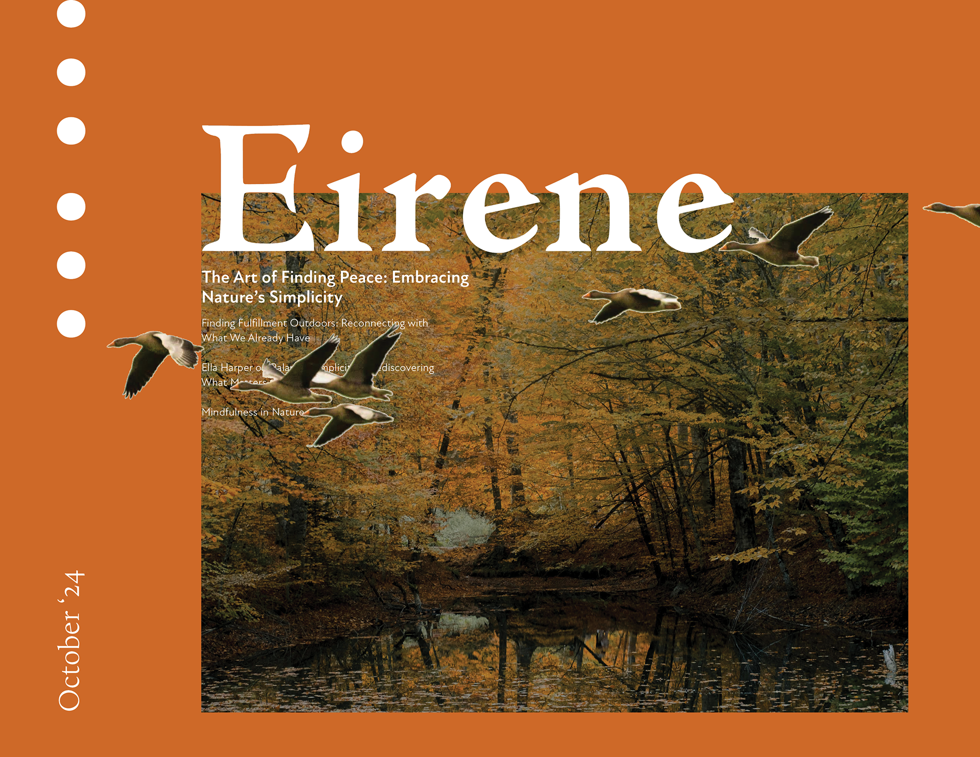
I wanted to create a publication that encouraged viewers to appreciate nature's beauty in its natural form without material objects or man-made modification.
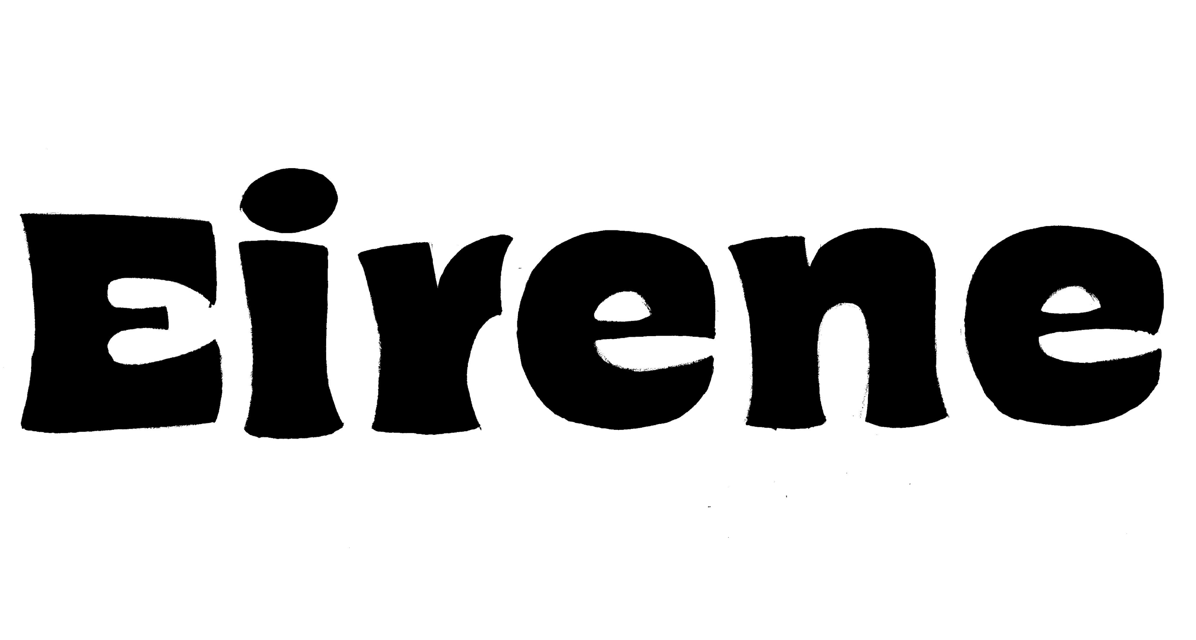
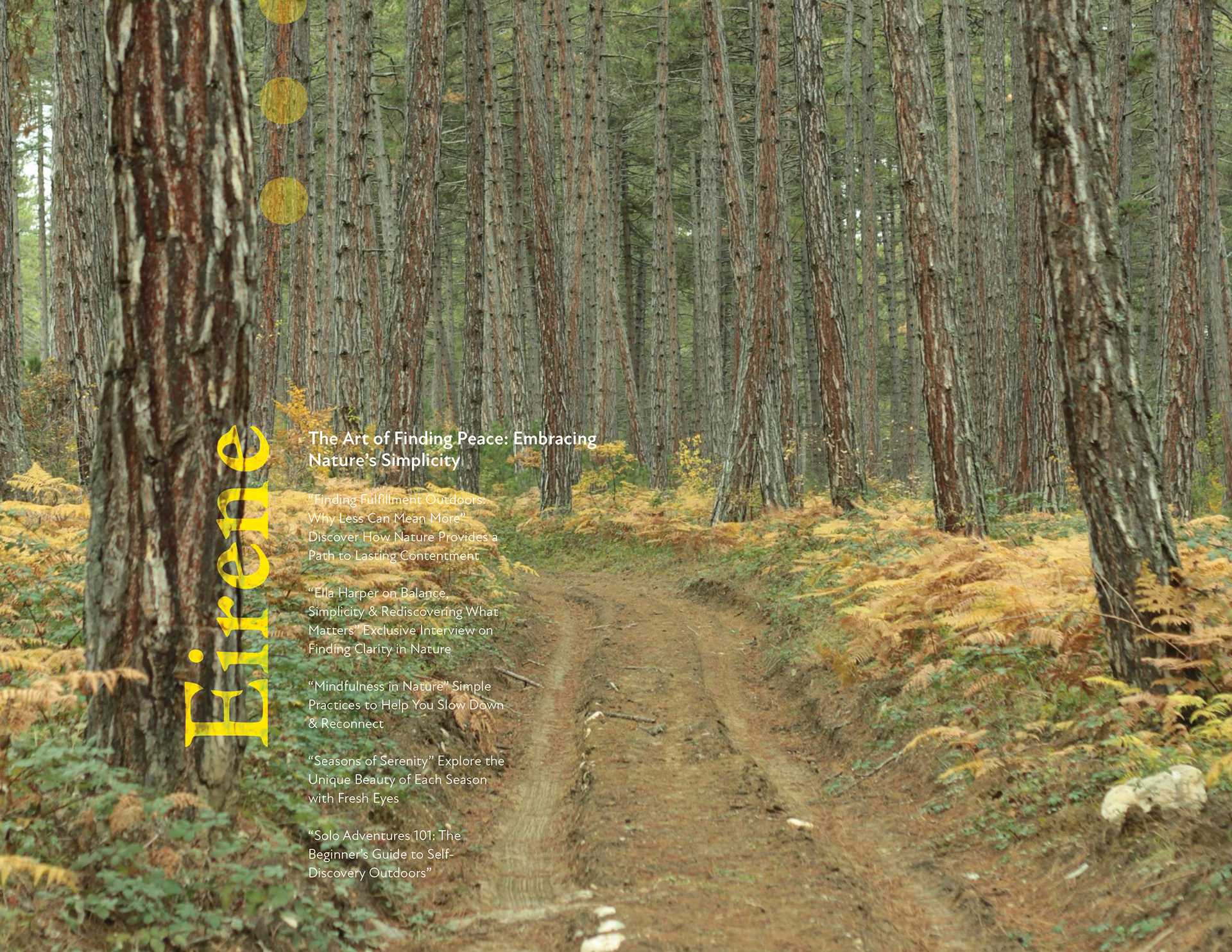
Creating a Word Mark
Experimented with different fonts and different methods of manipulation to create a word mark that represented the message behind Eirene. Used different systems to express the peace, contentment and serenity found in creation.
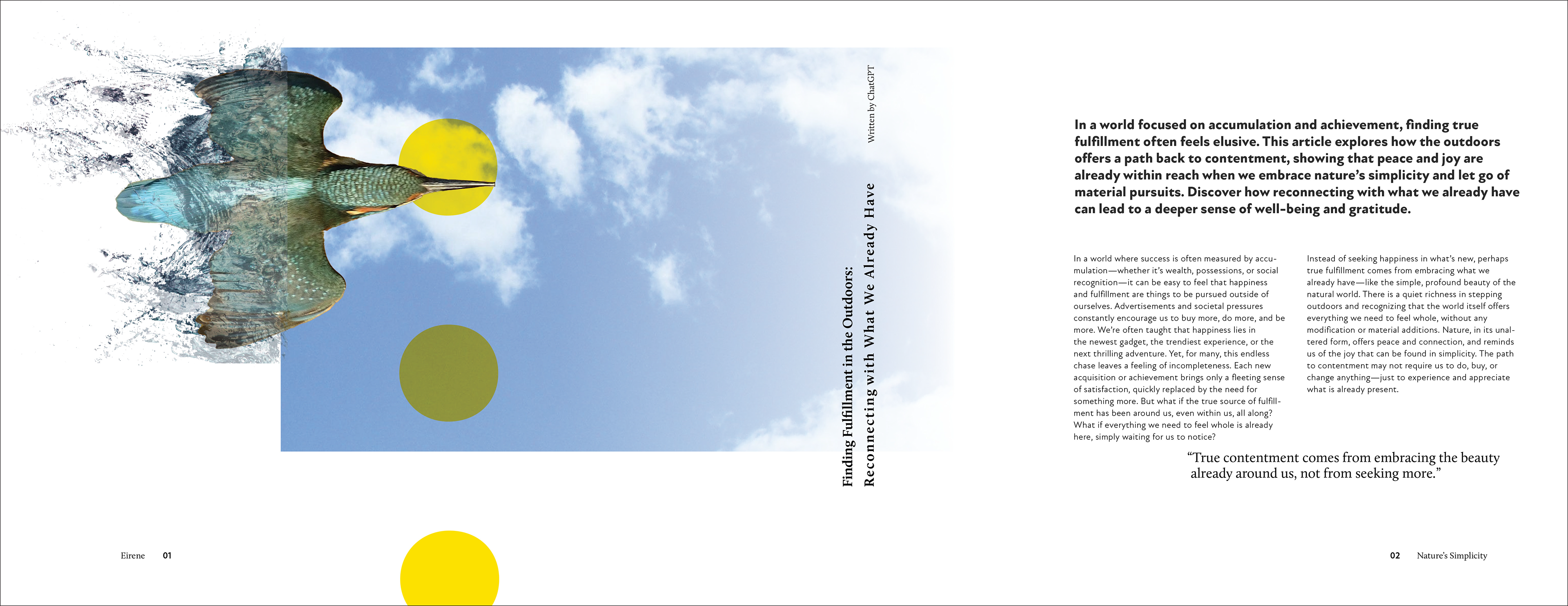
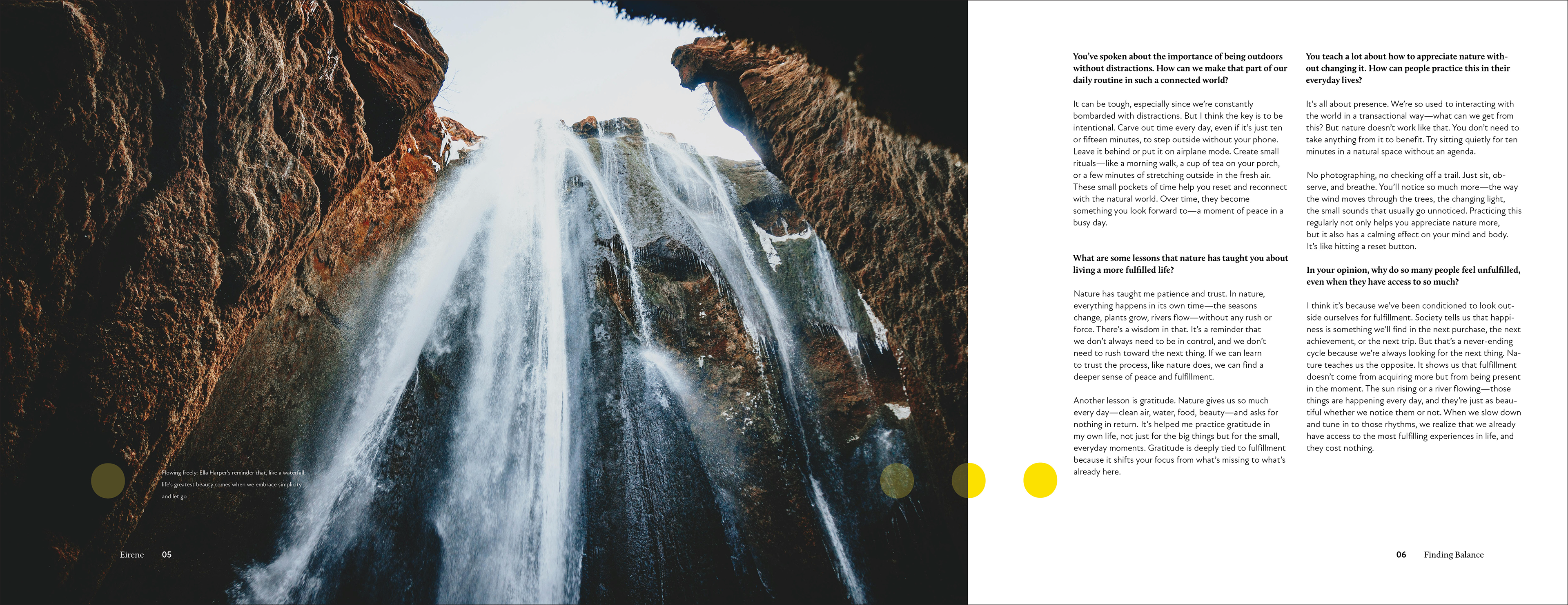
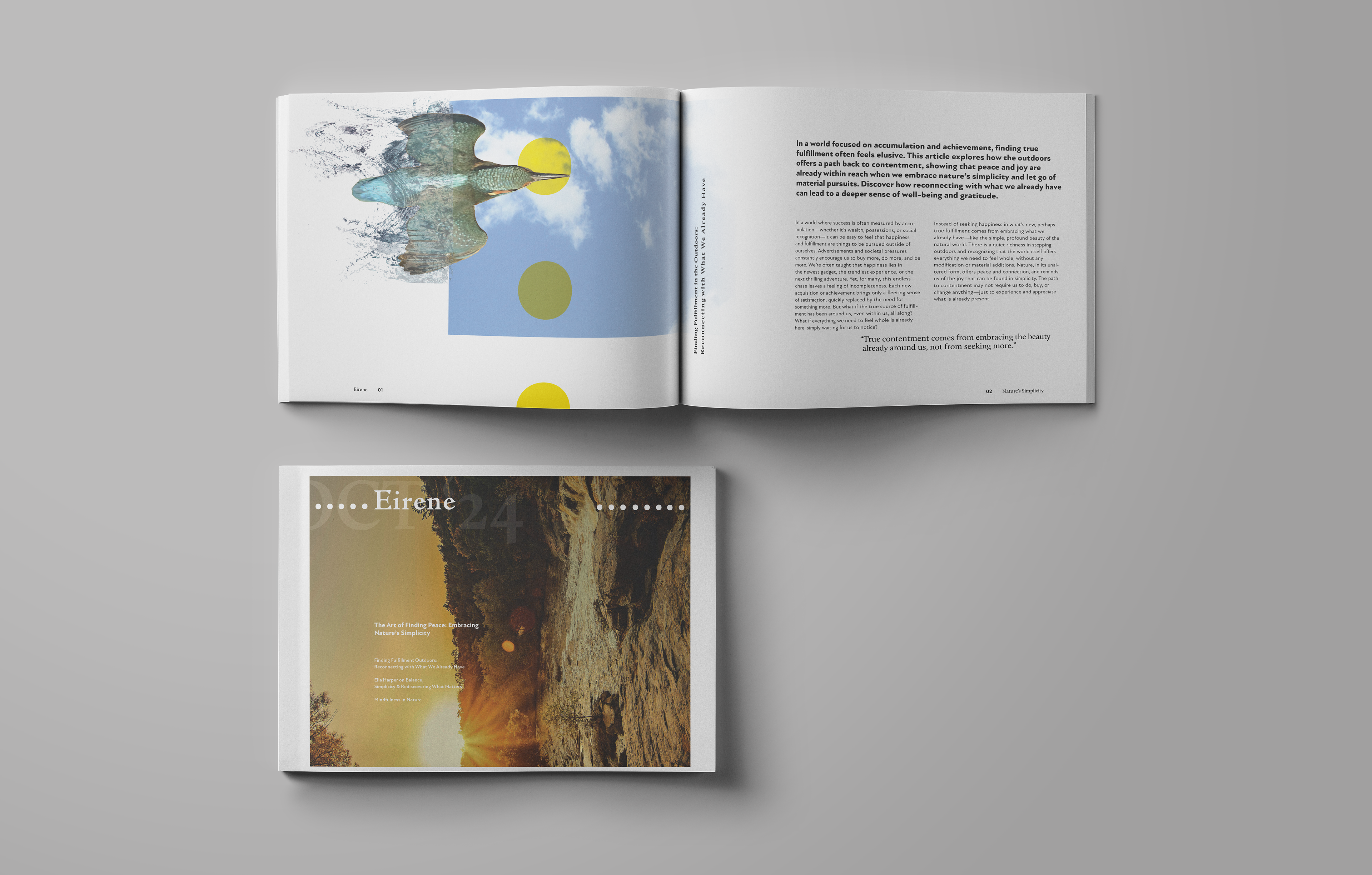
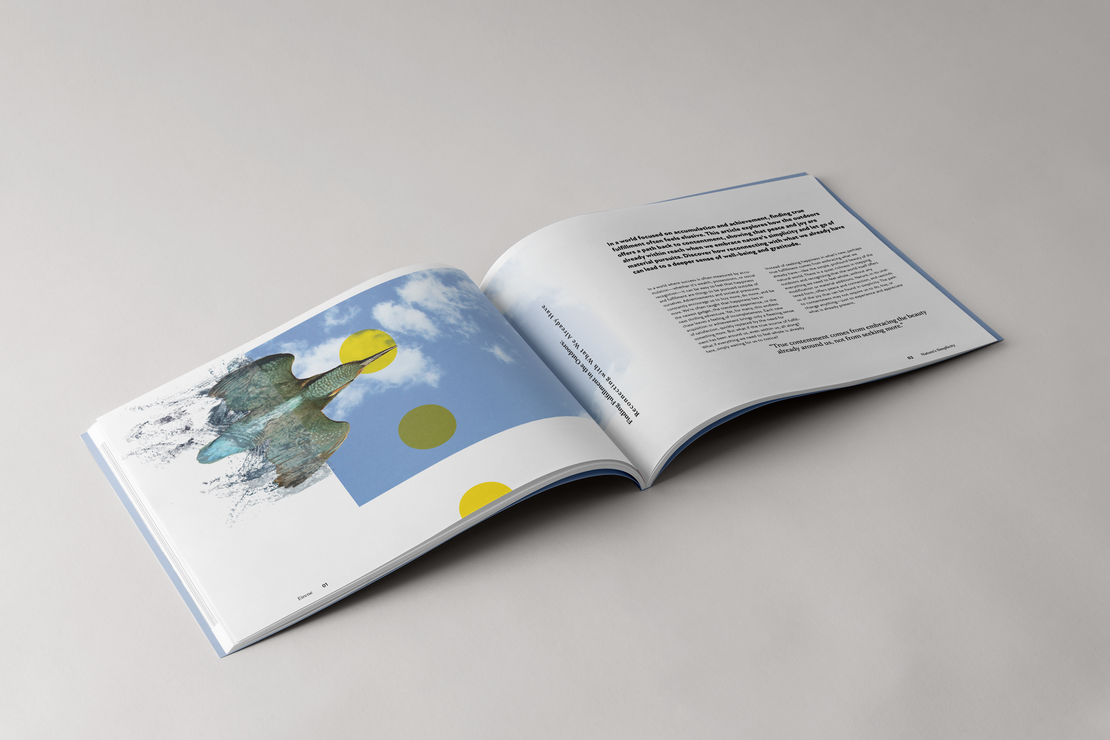
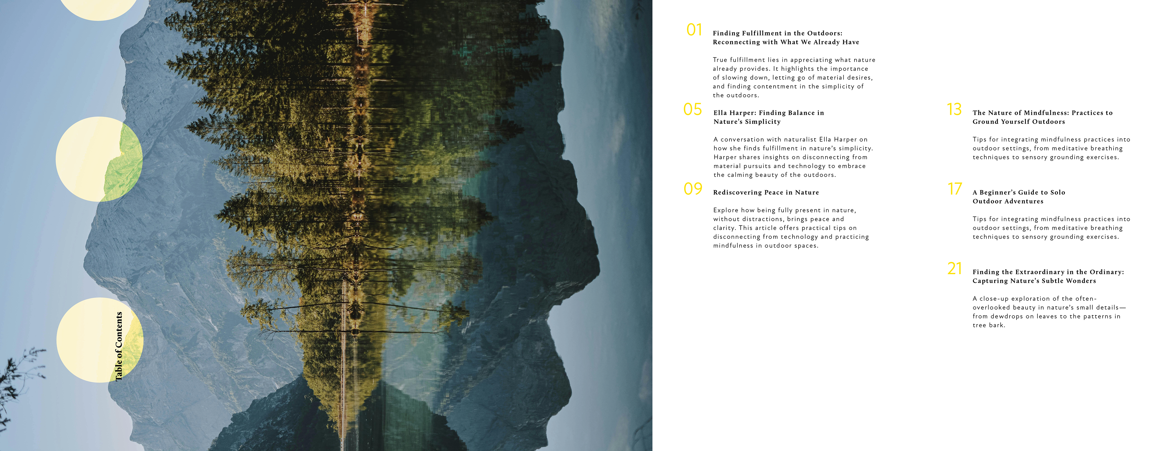
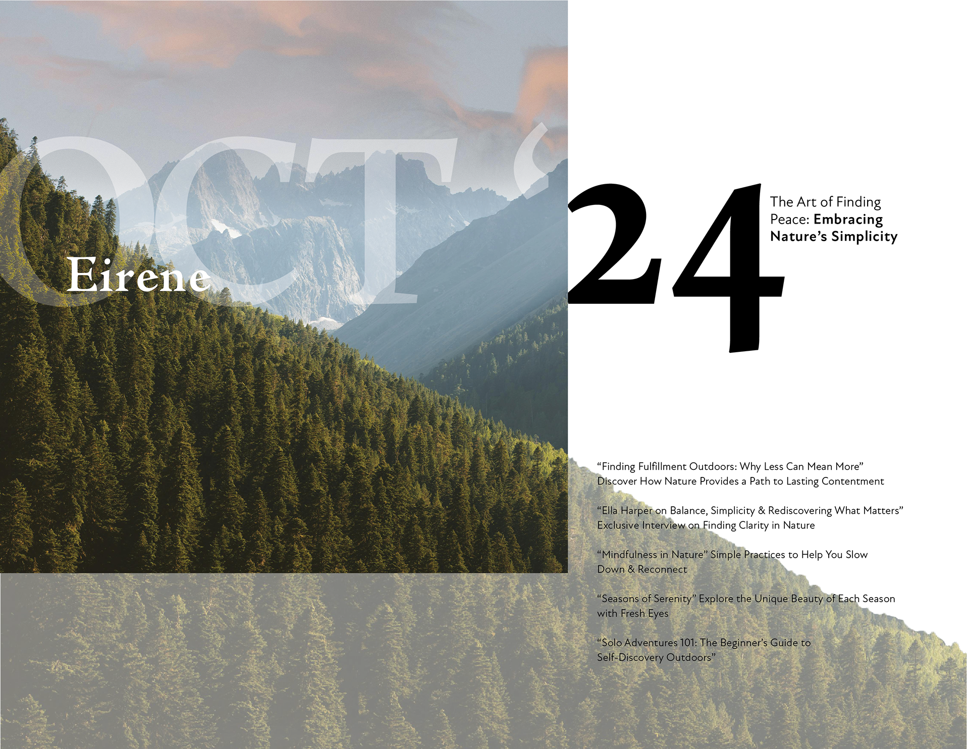
A Complete Publication
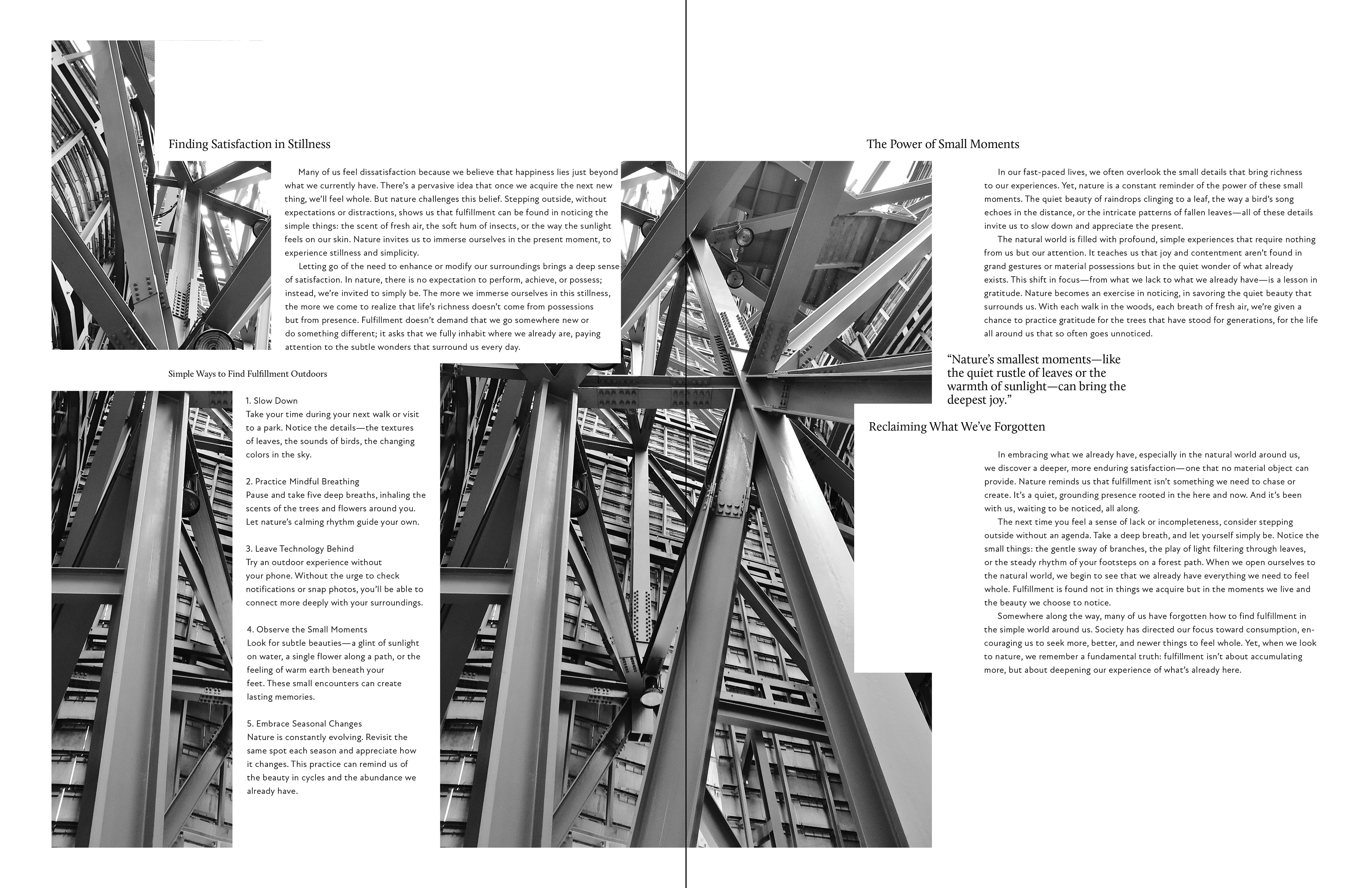
After completing the wordmark moved on to creating the publication itself. This involved create countless iterations that experimented with typographic placement and image layout
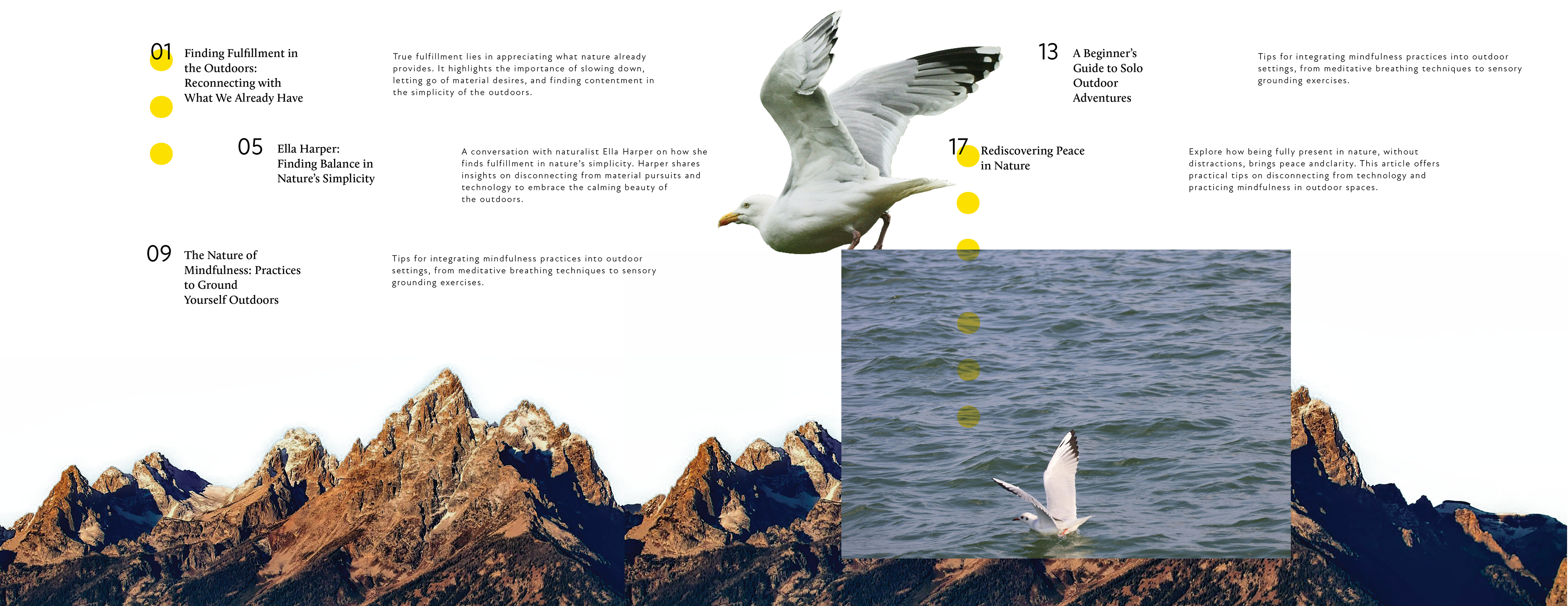
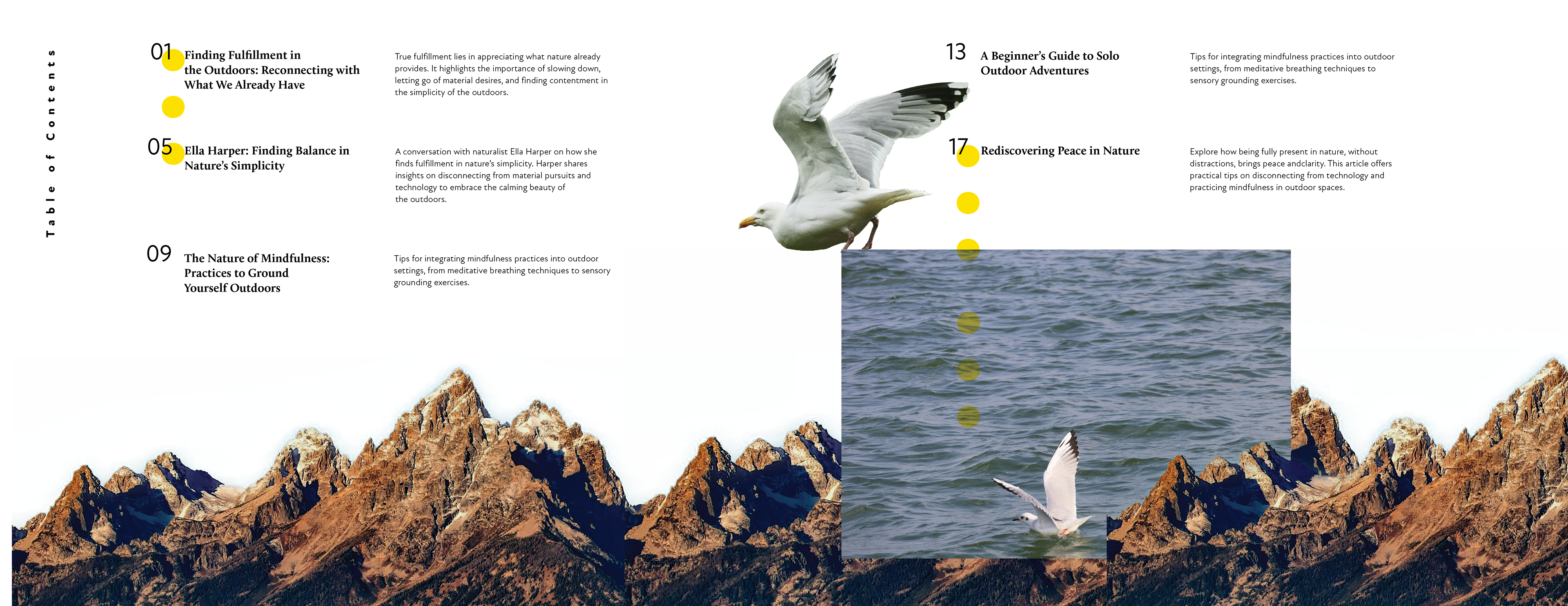
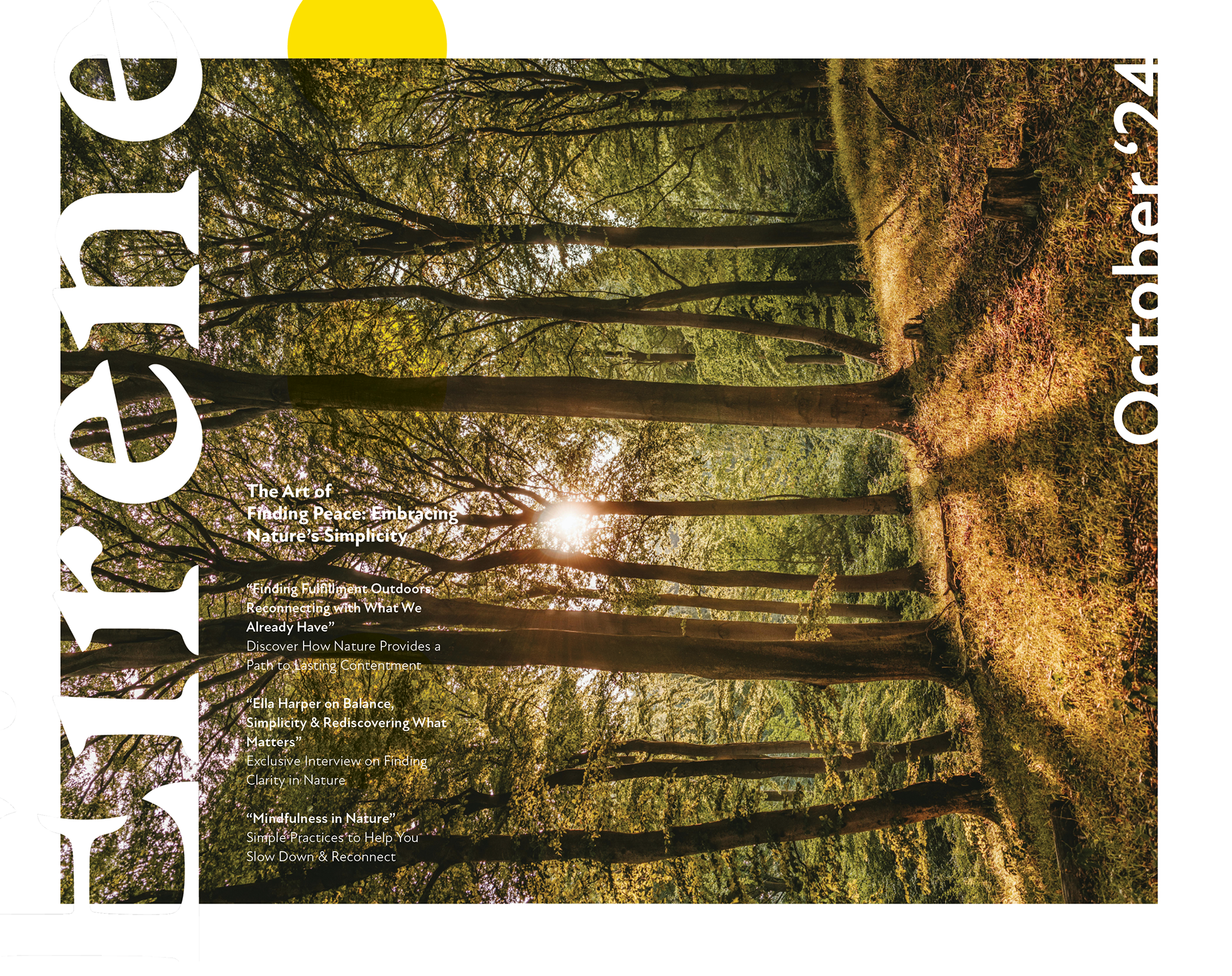
Article Iteration
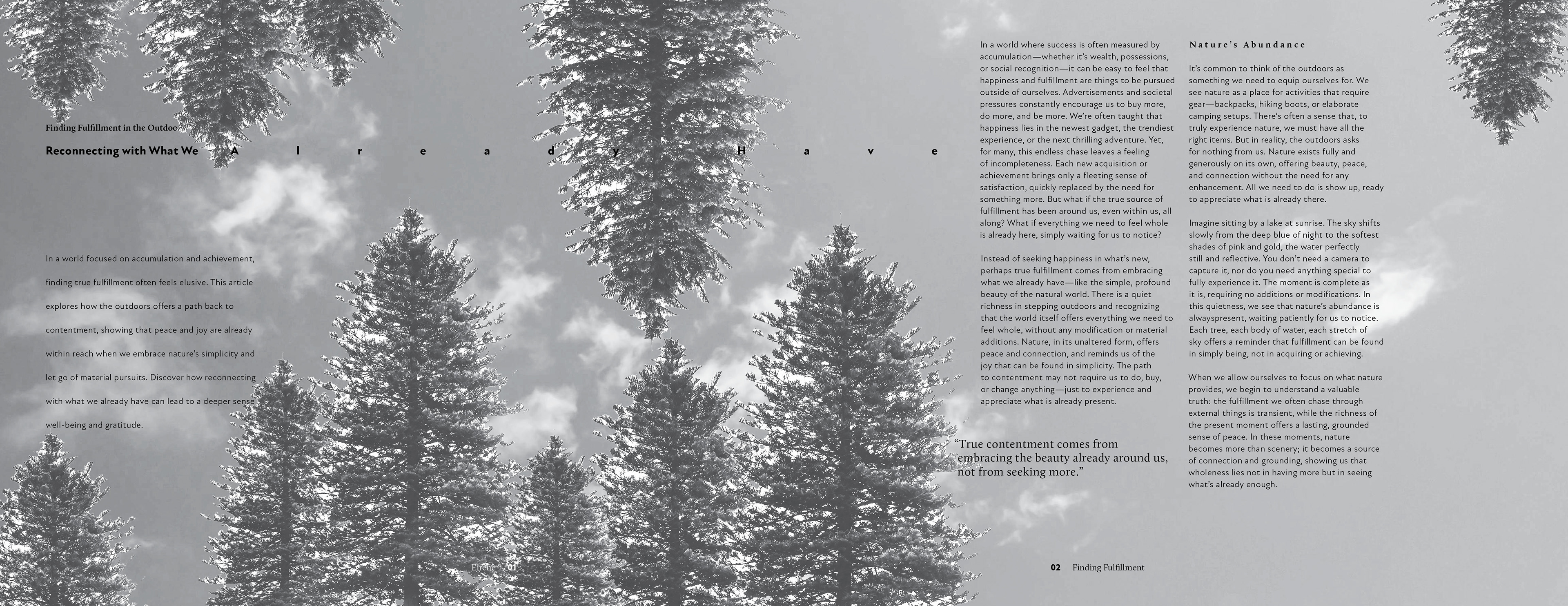
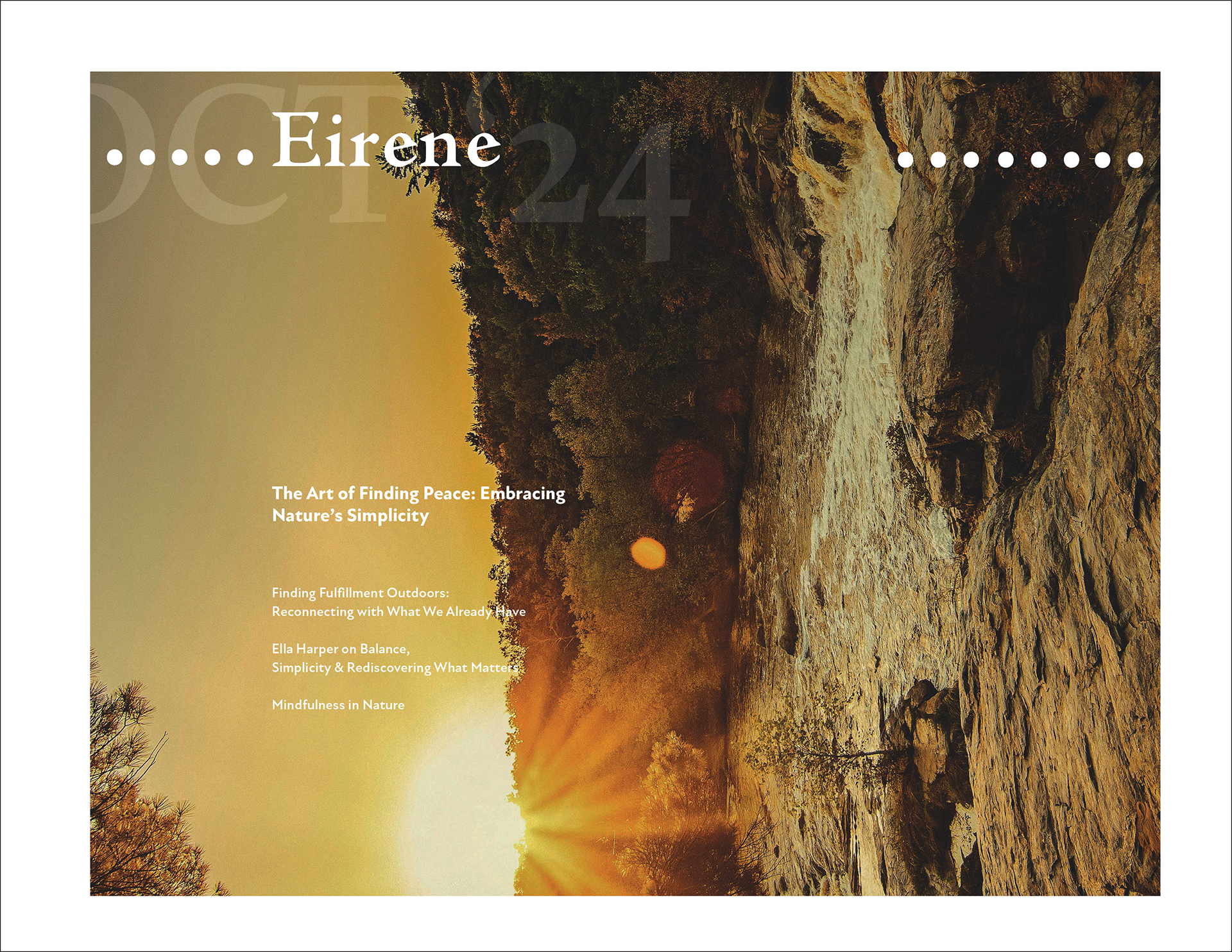
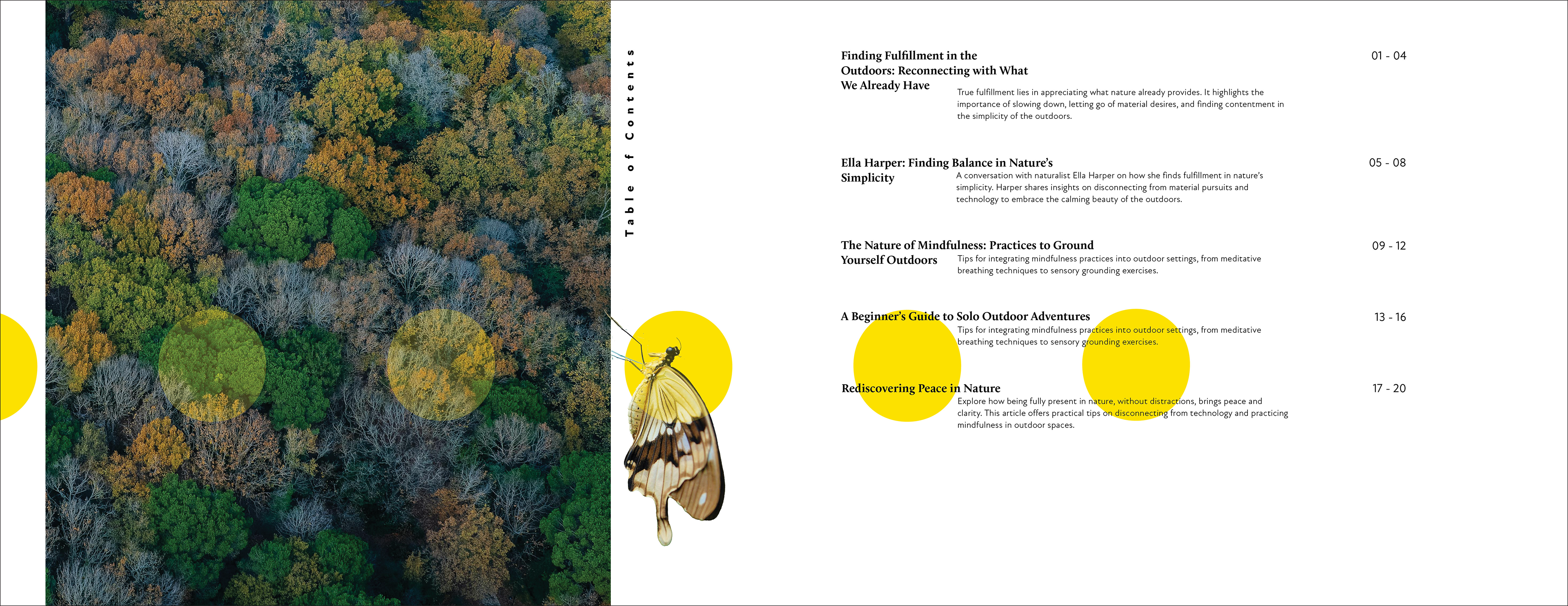
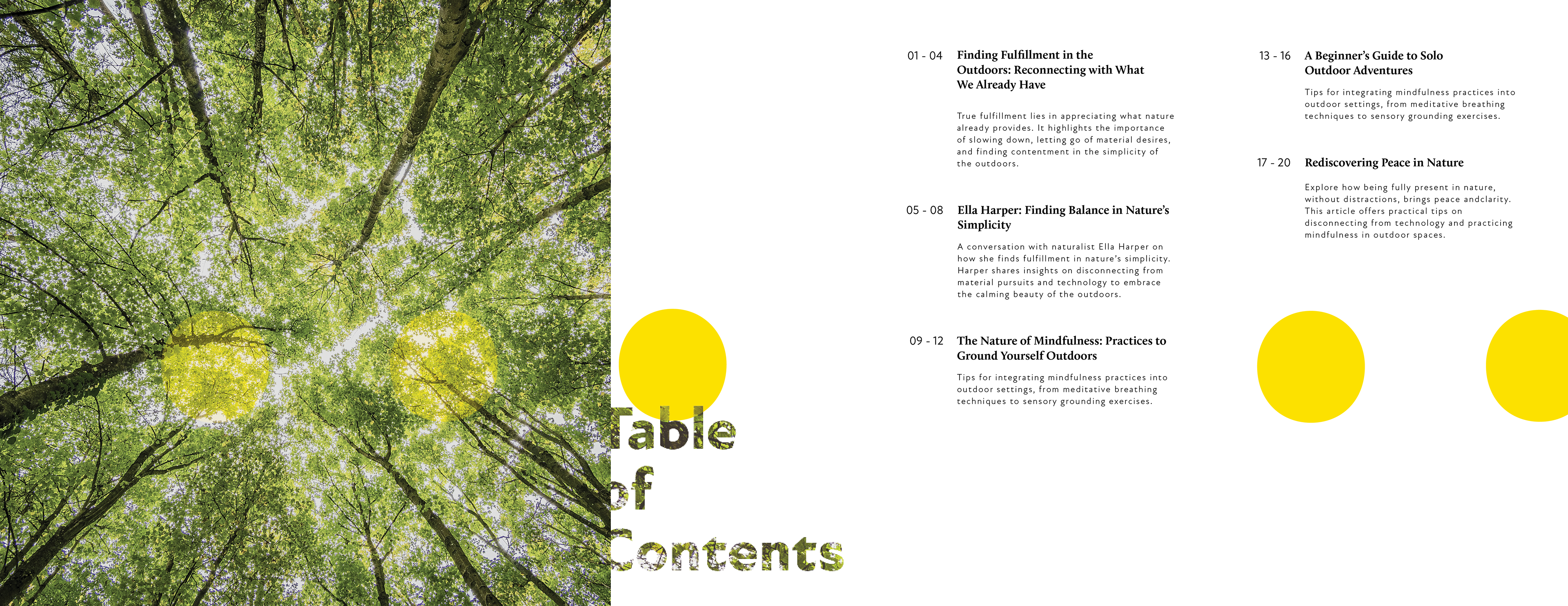
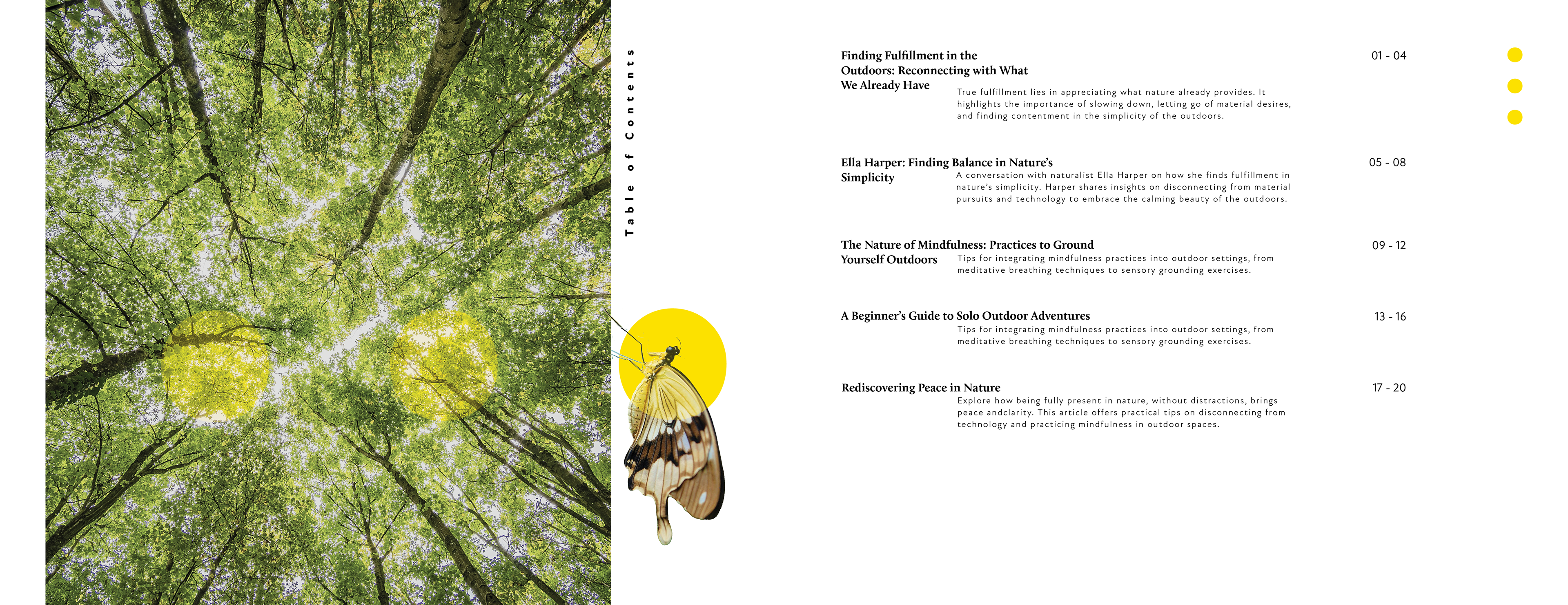
Cover and Table of Contents
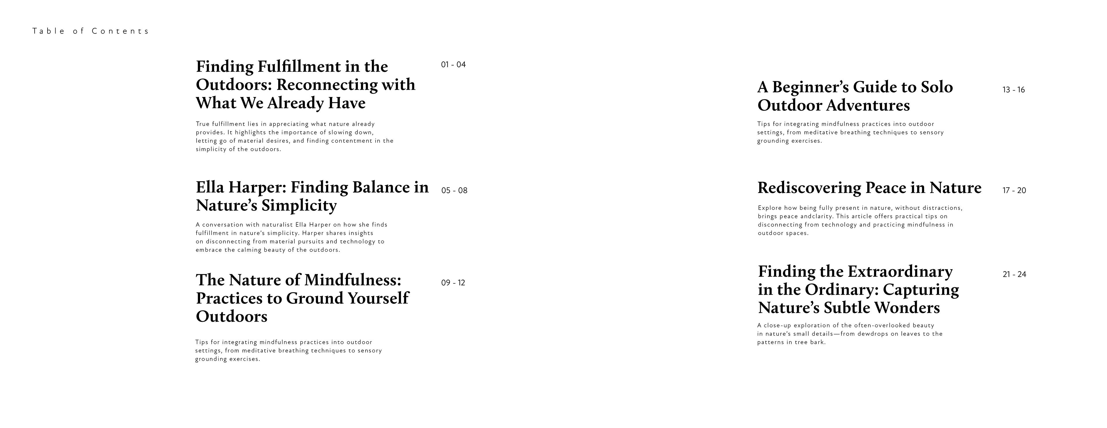
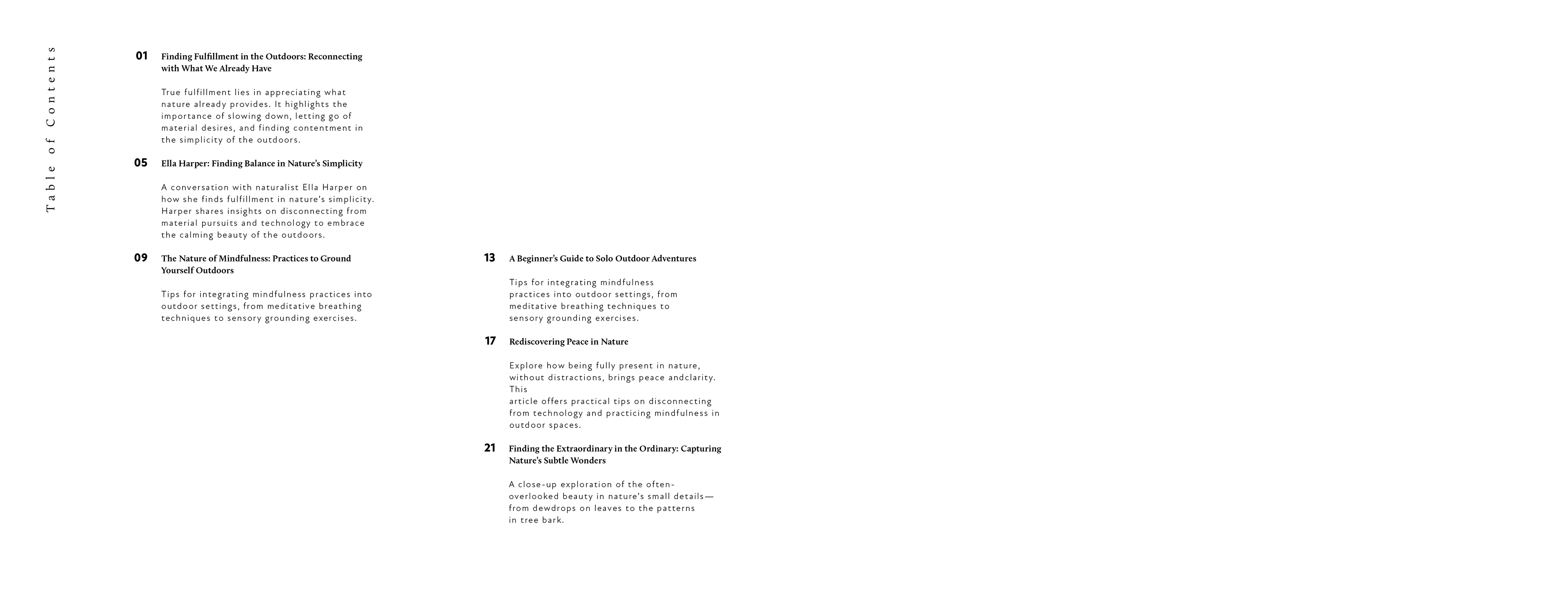
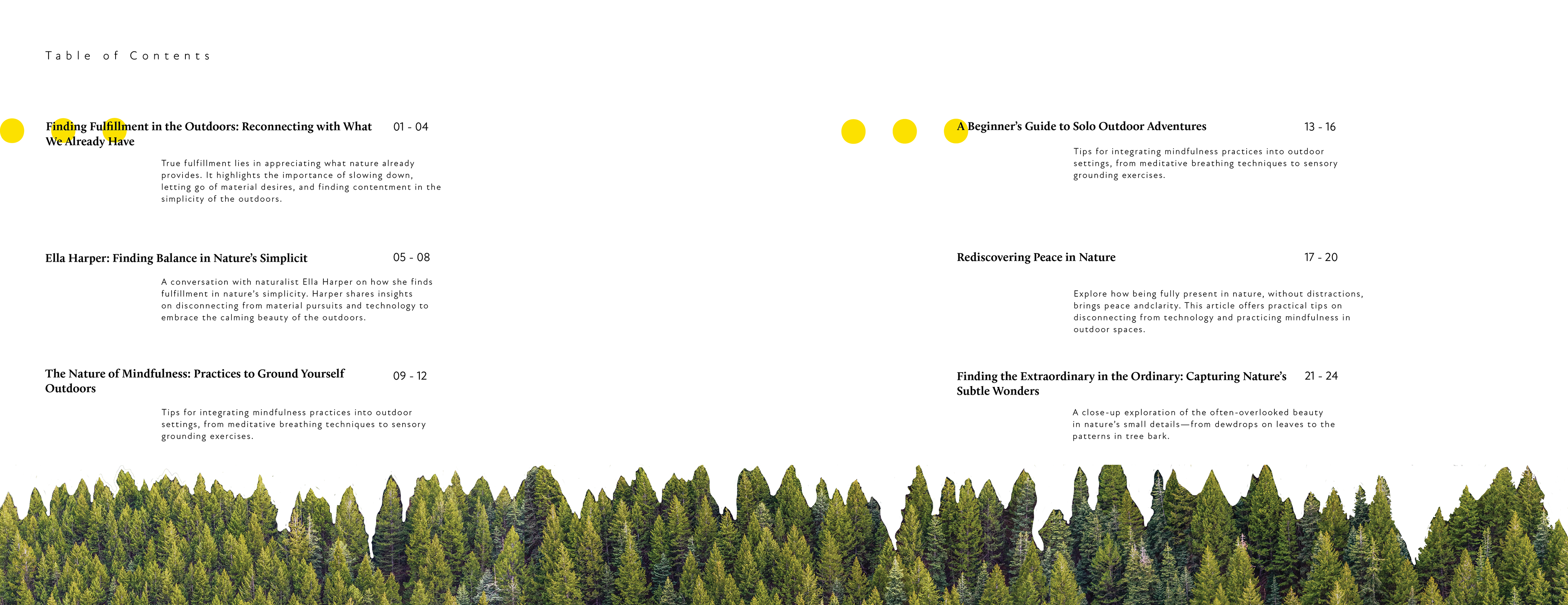
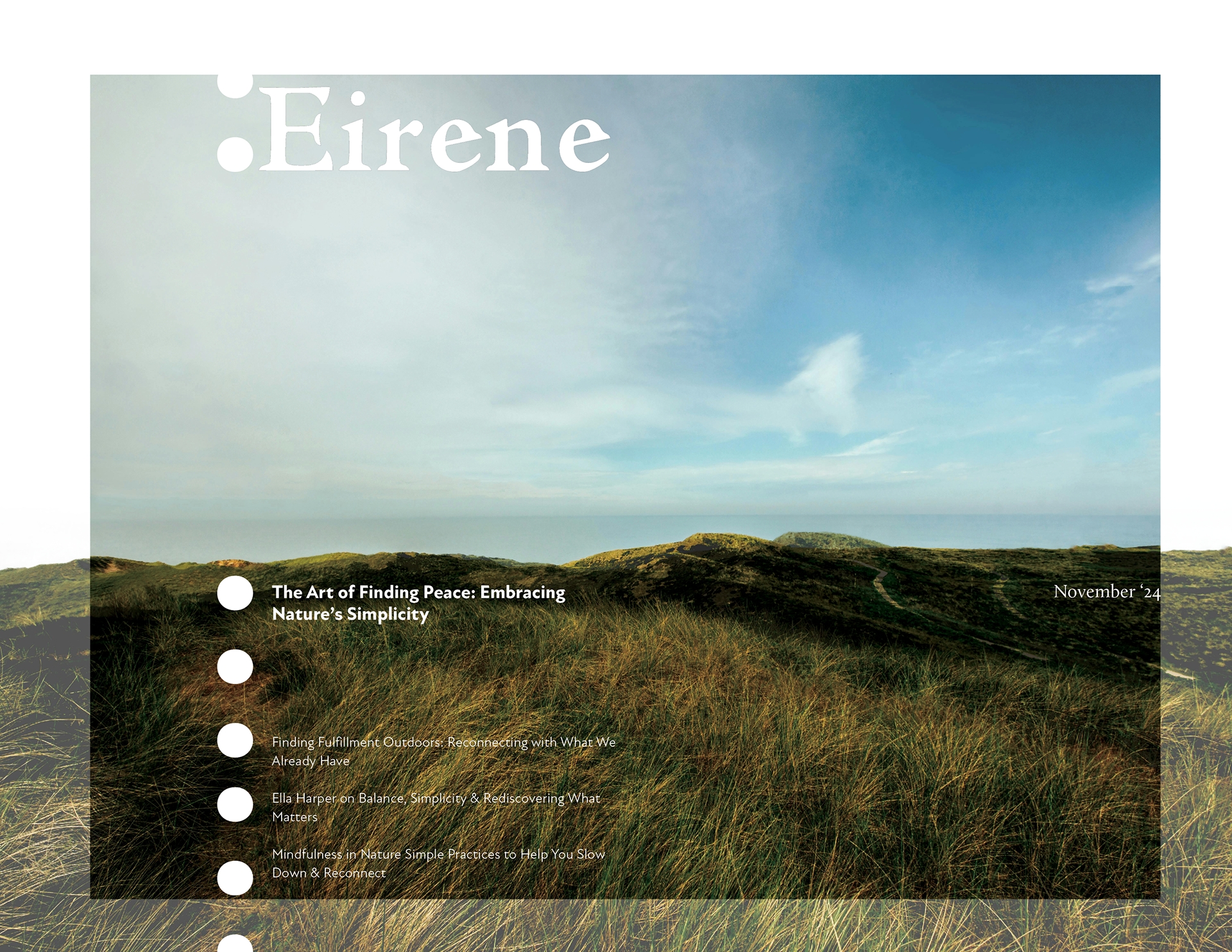
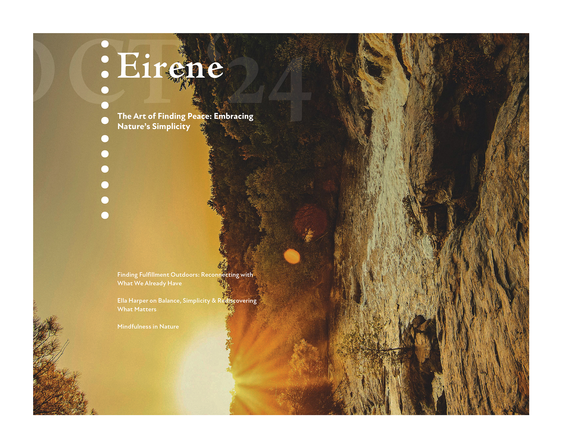
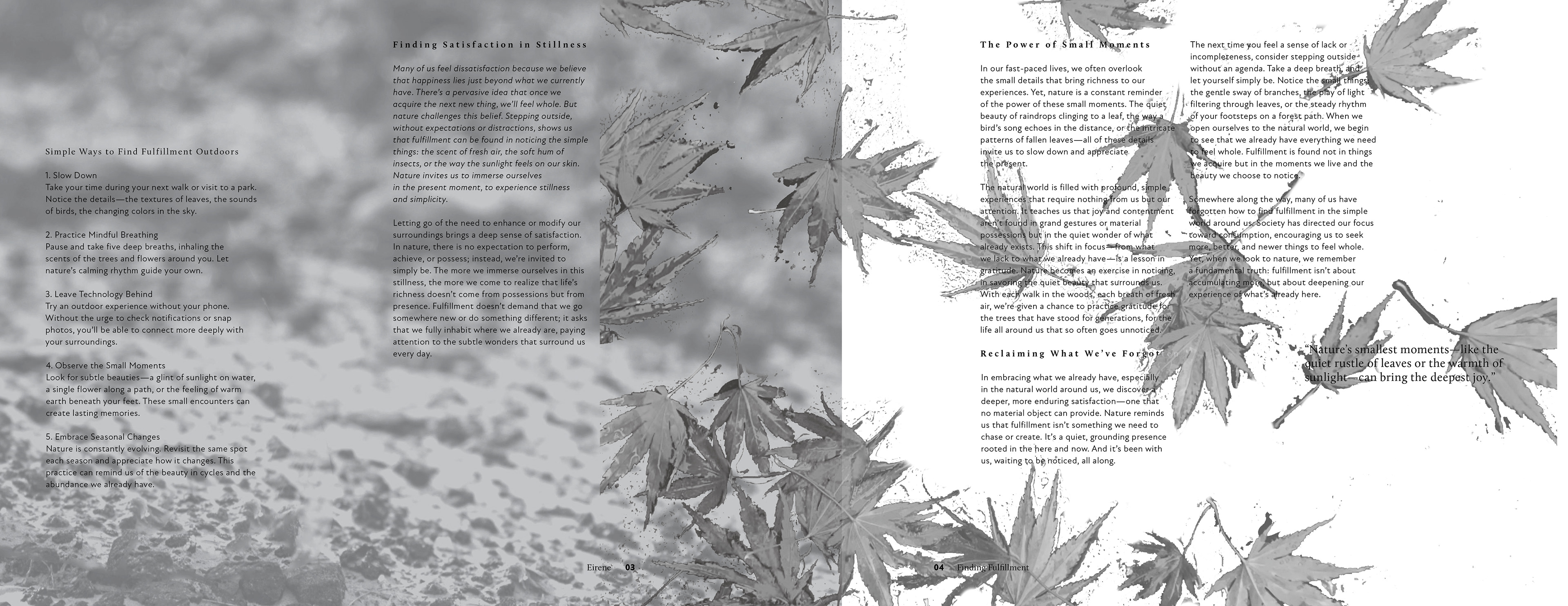
Final Layout